The Wine Spot
A full website redesign focused on accessibility, information architecture and conveying the same, welcoming atmosphere of the in-person experience.

Objective
An exercise in full website redesign.
A study in how different experiences online vs. in person shapes their overall feel and attitude of a business.
My Role
Research
Prototyping
Storytelling
User Flow
Design
Constraints
Two pages of the Wine Spot’s website, ‘Shop Online’ and ‘Current Menu’, are hosted by third party platforms and were excluded from this project redesign.
Tools
Figma
Duration
4 months
The Challenge
The Wine Spot is a cherished neighborhood bar, known for its extensive selection of wines and beers at every price point-perfect to enjoy in-house or take home. With expertly crafted cocktails, artisanal charcuterie, and a warm, inviting atmosphere, it’s a true local favorite. However, its current website fails to reflect this experience. Outdated design, blurry images, poor information architecture, and inaccessible color choices create a frustrating user experience. Visitors find the site overwhelming, difficult to navigate, and disconnected from the vibrant, welcoming feel of The Wine Spot they know and love.
People looking for a wine bar wouldn’t want to visit The Wine Spot based off of initial impressions from the current site.
The overwhelming amount of text and lack of structure makes it hard for users to quickly grasp key information.
100%
of users interviewed appreciate seeing a space before visiting -especially when considering accessibility.
Shoppers feel discouraged when the online inventory doesn’t reflect what’s available in-store, leading to a loss of trust and diminished convenience.
How might we design the website to reflect the warmth and vibrancy of the physical store while creating a clear and balanced hierarchy of information?
Qualitative Interviews
I interviewed individuals who had all visited The Wine Spot at least once. For two of them, it was their go-to neighborhood bar, while the others had different favorites.

It’s really important for me to see pictures of a place before I go in person. It helps me know what to expect! I also like seeing how they market themselves-seeing how they display the vibe and speak to the flavors and presentation of a space.
--McKenna Glorioso, Development Director

Branding matters. It has to look interesting, catchy. I’m always wary of something being overhyped. Any food or beverages needs to be visually showcased on the site. If I can't see it, I don't want it. I need a sense of what I’m getting into.
-Mindy Roth,
Director of Operations
As someone with a hearing disability, it’s important to see a space before I arrive so I can scope out where the least noisy areas will be. It’s frustrating when websites don’t show clear pictures of their interior space.
-Tyler Ferguson,
Therapist
Insights
I designed a persona to serve as a cumulative representation of all the common user needs, goals, thoughts, feelings, pain points and actions into account, that I derived from interviews and insights.

Sarah Mason
Development officer for the Cleveland Orchestra
32
Master's
Cleveland Heights, OH
“It has to pass the vibe check”
Frequently used apps:

Motivations
Loves an intriguing wine list-enjoys seeing things she doesn’t recognize but wants to try.
Seeing pictures of the food, drinks, atmosphere is crucial.
Make friends with the bartenders or other people at the bar.
Getting top quality recommendations from bartenders-likes knowing where to go based off of recommendations she trusts.
Attending wine tastings featuring wines she’s never tried before-always enjoys trying something new.
Always on the lookout for a bar with excellent craft cocktails
Frustrations
Won’t go to a bar that looks “basic”.
Desire is fueled by good branding- a bar’s website has to look interesting. If it doesn’t appear that way online she won’t go.
Wine bars with an inaccurate or outdated online inventory. Especially if she lives close, she wants to see what’s currently available for pick up.
Checking Out Our Competitors
A competitive analysis of similar wine bars revealed how effectively—or ineffectively—their brand values were conveyed and what main features the business prioritized on their sites. This insight helped identify opportunities for growth and differentiation in my solution.

Opportunity Areas
Simplify Navigation
Redesign navigation structure to make key actions such as signing up for the email list, browsing inventory, contacting the business, viewing the events, etc. more intuitive and straightforward.
Update + edit copy and photography
A complete revision of the current copy-the site has numerous spelling and grammar mistakes. Current photography is all blurry and outdated.
Improved landing page
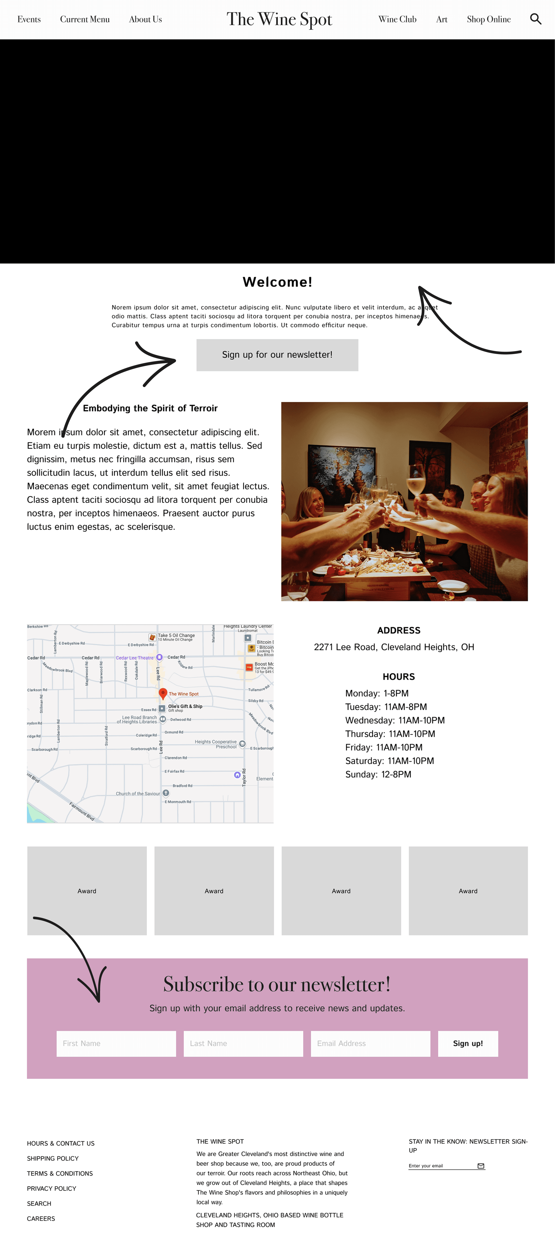
Home page should draw the user in with an inviting tone and visually pleasing layout. Should feature CTA, updated photography and hours/location, etc.
Brand consistency and accessibility
Slight revision of the branding colors for The Wine Spot to make it more accessible for all users.
Clearer CTA
Too many CTA buttons on the homepage
User Flow

I rearranged the user flow from its original form because I wanted users to be able to find all event groupings together. Now, users will be able to see upcoming events or seek out information about private events within the same tab. In addition, I gave users the opportunity to sign up for the Wine Club or the weekly newsletter directly from the website, where before, they would need to email the store or sign up in person. Based on user interviews, having the opportunity to sign up for something on the website rather than in person or over email will generate even more sign ups.
Lastly, the Wine Spot uses third party platforms for their online retail and current menu, so their owner asked me not to redesign either of those pages.
Branding
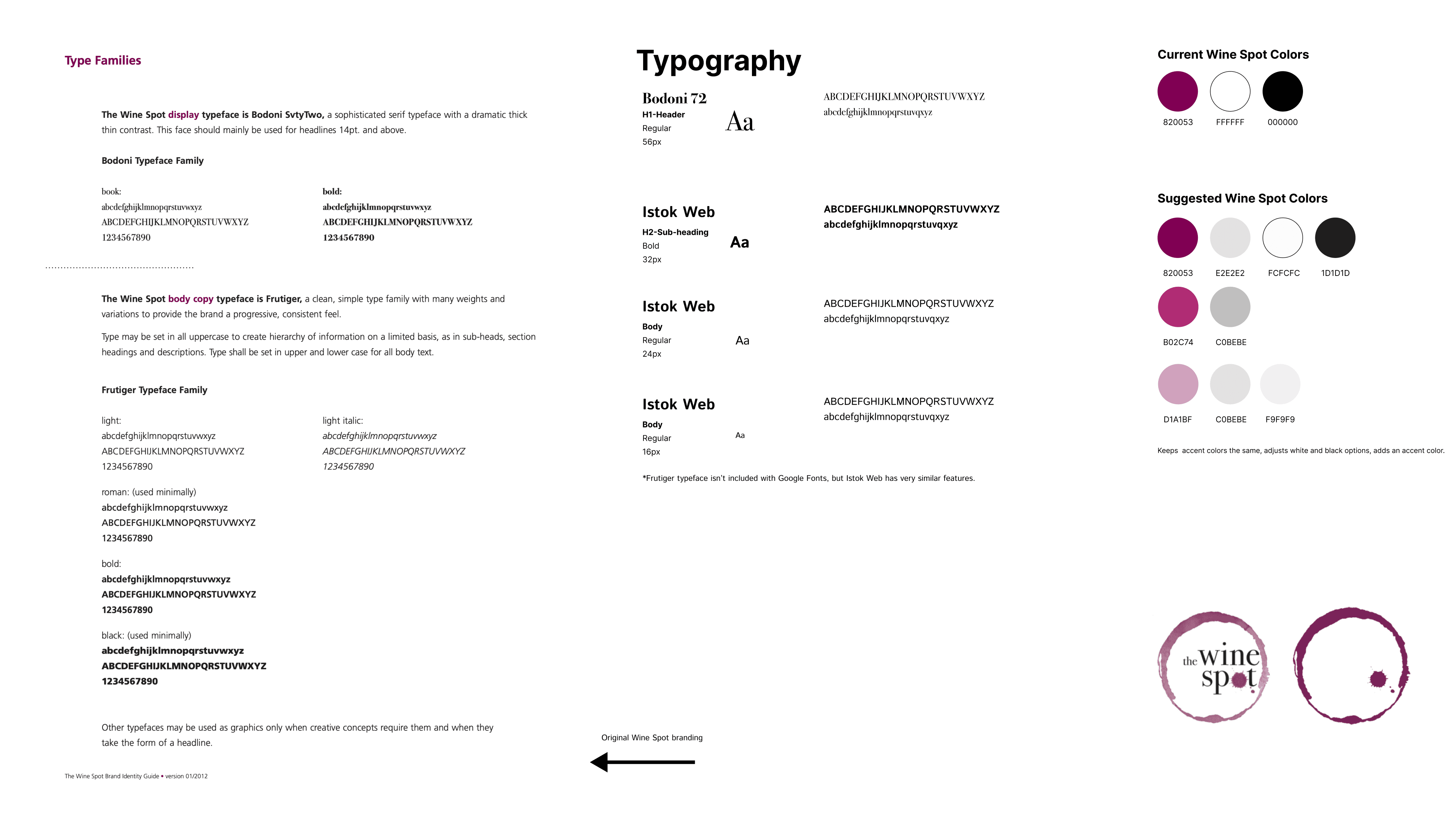
The Wine Spot already had strong, recognizable branding that was well integrated throughout their business. My goal was simply to make subtle adjustments to enhance accessibility on their website. Their existing color palette centered around a rich purple, along with true white and true black. Since the stark contrast of white and black can sometimes hinder readability, I softened those tones slightly and introduced a few neutral and complementary shades to create a more balanced palette.
I preserved the original header typeface and selected a body font that closely matches their existing choice, Frutiger, to maintain consistency.
Prototyping
Lo-Fidelity Testing
I created the first prototype to get feedback from people-it was a basic version of the site with three features-navigating the landing page, signing up for a newsletter and booking a private event.
Navigating the homepage
People liked the layout and really enjoyed seeing the video component-it gives a good idea of everything that the business has to offer.
The call to sign up for the newsletter might be “too” suggestive. Maybe the CTA button can direct them to the tiny form at the bottom of the page instead of taking them to an entirely new page?
Booking a private event
Seeing pictures of their private events will help provide some context and assurance of what the space could look like for their own event.
People want more information before submitting an inquiry form so they don’t waste their time.
How would this translate to mobile?

Hero image instead of video

Too much text with no end in sight...this would need to be reformatted as to not overwhelm the user.

Users appreciated seeing an image with each event, being able to sort events by month, but also agreed that the layout felt clunky.
High-Fidelity Testing
For the second prototype, I refined the design based on previous feedback, creating a more polished and elevated version of the site. This round of testing focused on three key features: signing up for the newsletter, booking a private event inquiry, and joining the wine club. I also gathered feedback on the ‘About Us’ and ‘Events’ pages. Given The Wine Spot’s loyal customer base, I aimed to collect diverse perspectives—not only from regular patrons but also from those unfamiliar with the bar—to ensure the redesign was truly user-friendly, conveyed a welcoming atmosphere, and encouraged new visitors.
Moderated tests:
5 Wine Spot customers
Unmoderated tests:
10 users

Task 1: Sign up for the weekly newsletter
Users appreciated:
Being directed to the sign-up from the CTA button
Fonts and color scheme
Love the hero video
Overall vibe is very inviting
Liked the “cheers” confirmation message
Users identified areas for improvement:
Having to scroll slightly to see the CTA button
Signing up for the newsletter-refined wording could encourage sign-ups.
Task 2: Peruse the ‘About Us’ page
Users appreciated:
Learning about the full time staff- builds rapport and makes the in-person experience more comfortable and fun
Initial block of text is too long-too overwhelming and not scannable
Confusion about the word ‘Terroir’-users want it defined or revised
Needs less text about the business and more of a story
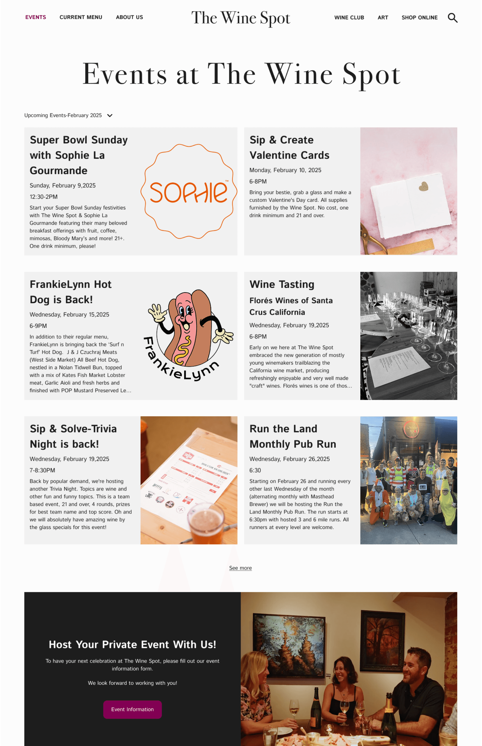
Task 3: Find upcoming events
Users appreciated:
Having a visual of each event
Each card lists times and descriptions
The cards look like mini instagram posts, looks very social media in the right way
The layout (by month) to a full list or calendar view. People typically go to a business’s instagram page or social media to see upcoming events, but sometimes can get confused because things are often advertised really far in advance. Having everything laid out by month on their website is reassuring.
The option to book a private event is still listed at the bottom of the page in case they missed it in the navigation bar.
Users identified areas for improvement:
Confusion about cards with extended text. Would they be directed to a new page?
Visually overwhelming-too busy
‘Upcoming Events-Feb 2025’ was easily overlooked
Info on each event could be more concise.
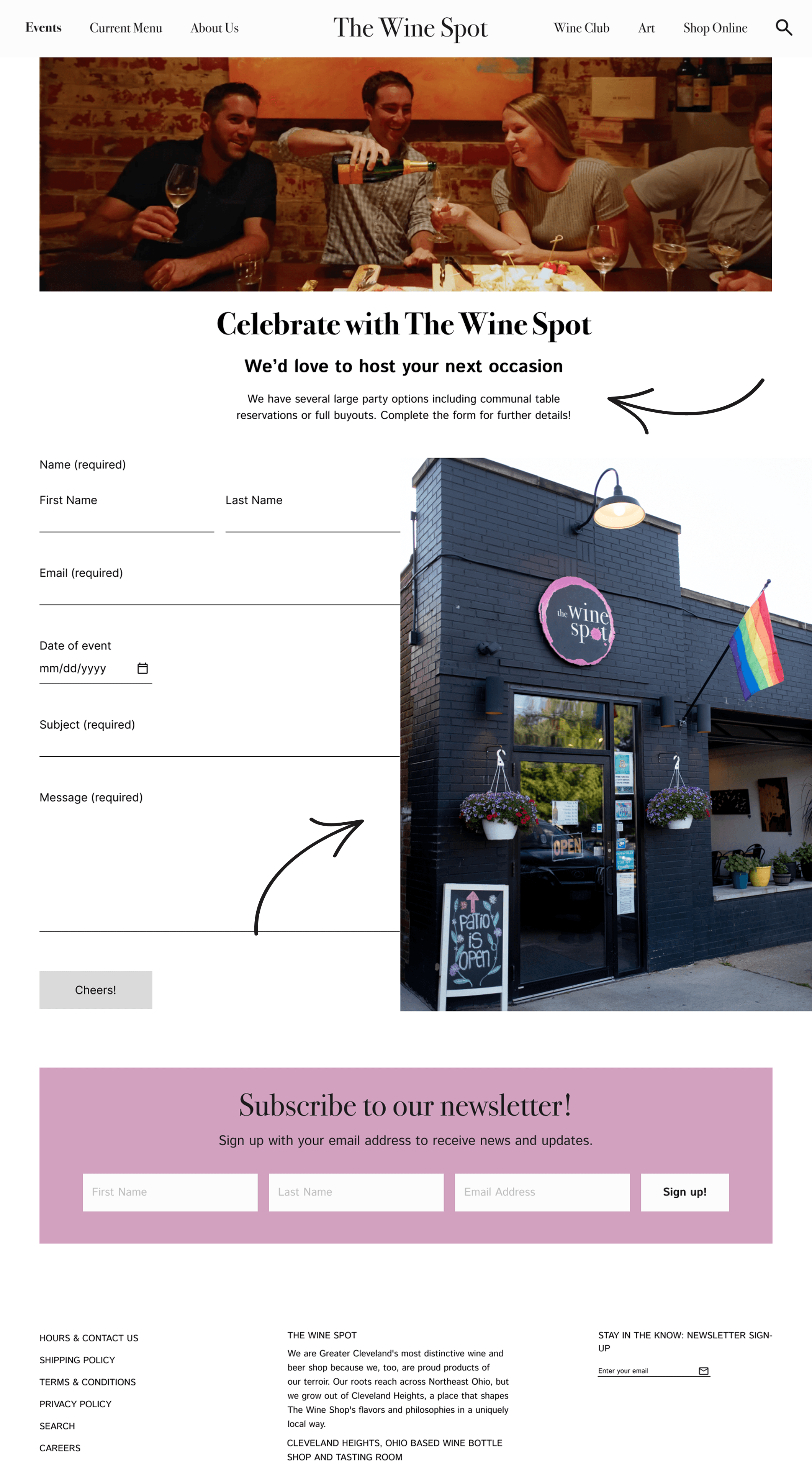
Task 4: Book an inquiry for a private event
Users appreciated:
Love the visuals
Easy and digestible information. Feels like I have enough info to submit an inquiry
Having private events nested inside of Events in the top nav bar
Seeing pictures of the other private events -you can get a sense of what your event will look like
“Cheers” success page
Users identified areas for improvement:
Accessibility features needs to be added to event details blurb
Make some of the input fields required/not required
Task 5: Sign up for the Wine Club
Users appreciated:
The only way to currently subscribe to the Wine Club is over the phone or through email correspondence. Being able to sign up on the website rather than in person or over the phone was unanimously the preferred method of users tested.
Users identified areas for improvement:
Difficult read the white on purple (Wine club overview)
Make some of the input fields required/not required
A little light on on logistics info-would appreciate more clarification.
The “”Sign Up” button is the same as the Newsletter’s-confusing.
Final Revisions
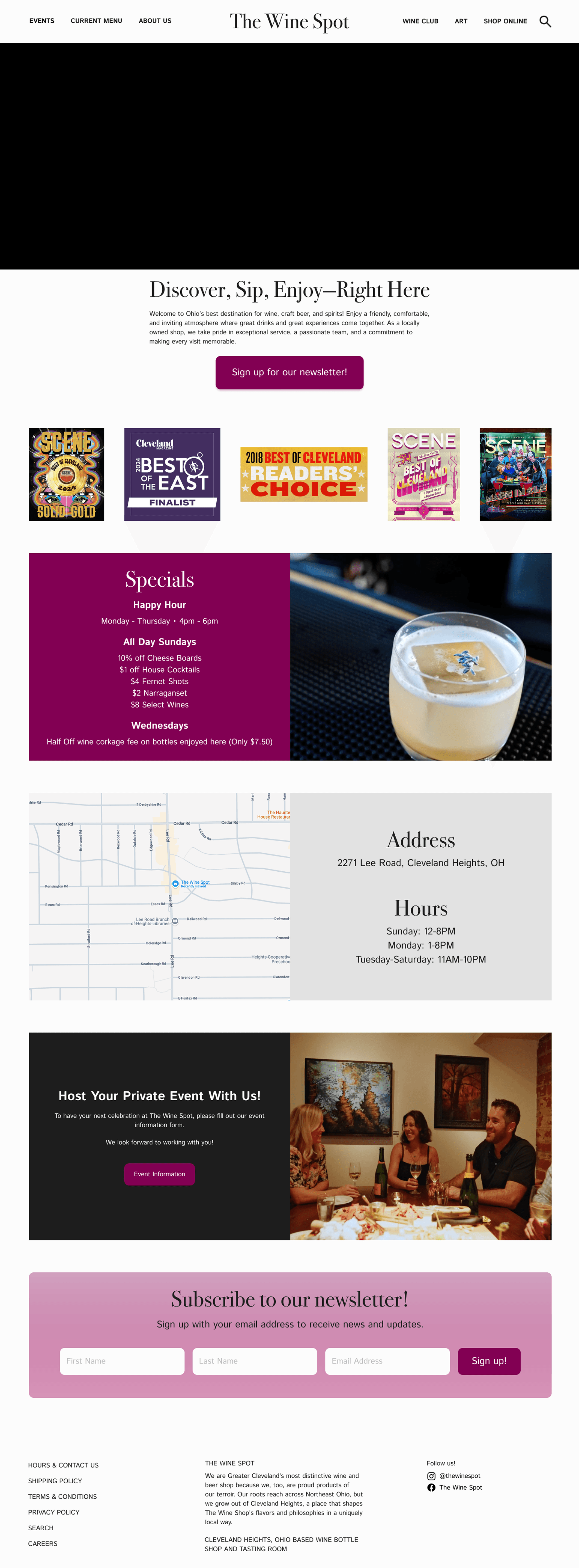
Homepage
" height="20px" id="PfsqhKfXC" transform="translate(2 2)" width="20px"/></svg>)
Added “we best keep in touch by newsletter” in the Hero section.
" height="20px" id="dbUKS5z1N" transform="translate(2 2)" width="20px"/></svg>)
Eliminated “Embodying the Spirit of Terroir” card
" height="20px" id="YU0R7Dko3" transform="translate(2 2)" width="20px"/></svg>)
Moved ‘Address and Hours’ card higher on the page.
" height="20px" id="knehu0MaS" transform="translate(2 2)" width="20px"/></svg>)
Moved awards lower on the page so as not to compete with the information architecture.
Before

After

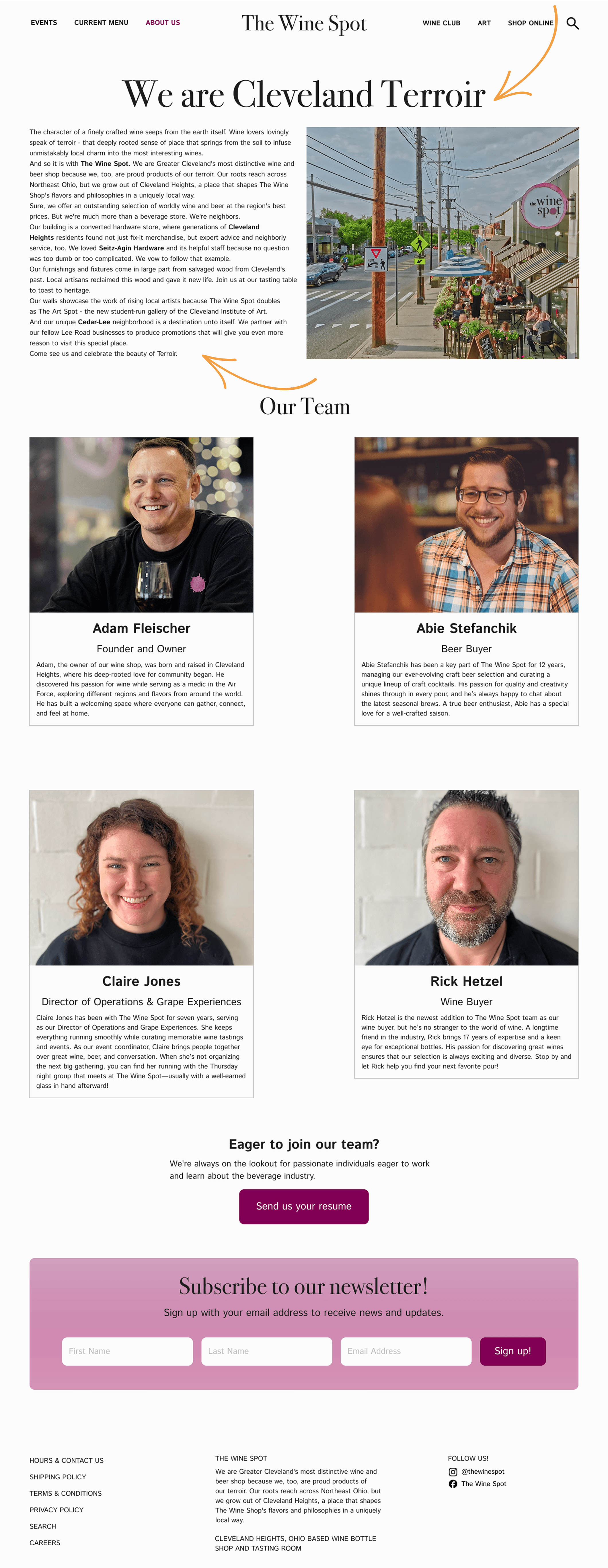
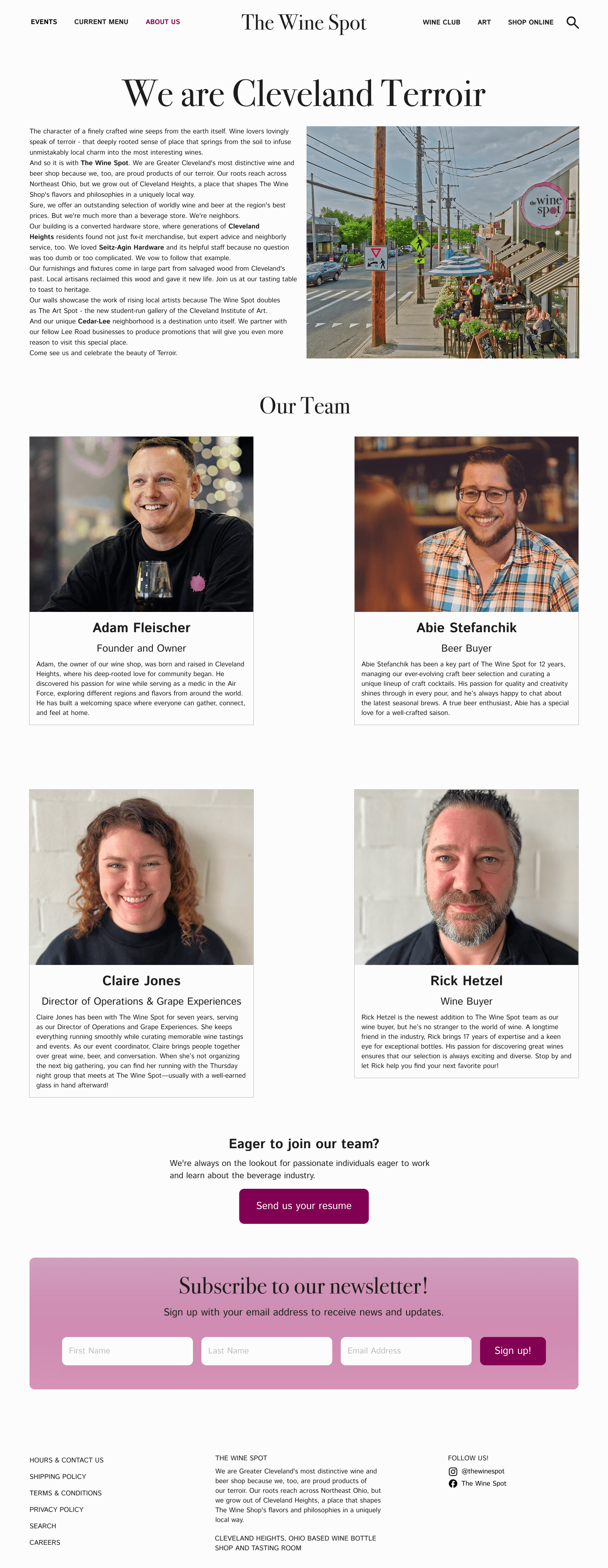
About Us
Provided a clear definition of ‘Terroir’ that also aligned with The Wine Spot’s values.
Broke up the big block of text and utilized a storytelling approach with additional photos and section headers for added context.
Included a ‘Where to find us’ card with address, phone number, email and social media hyperlinks.
Reconfigured the staff cards to make them easier to read and adaptable to different sizes.
Before
After

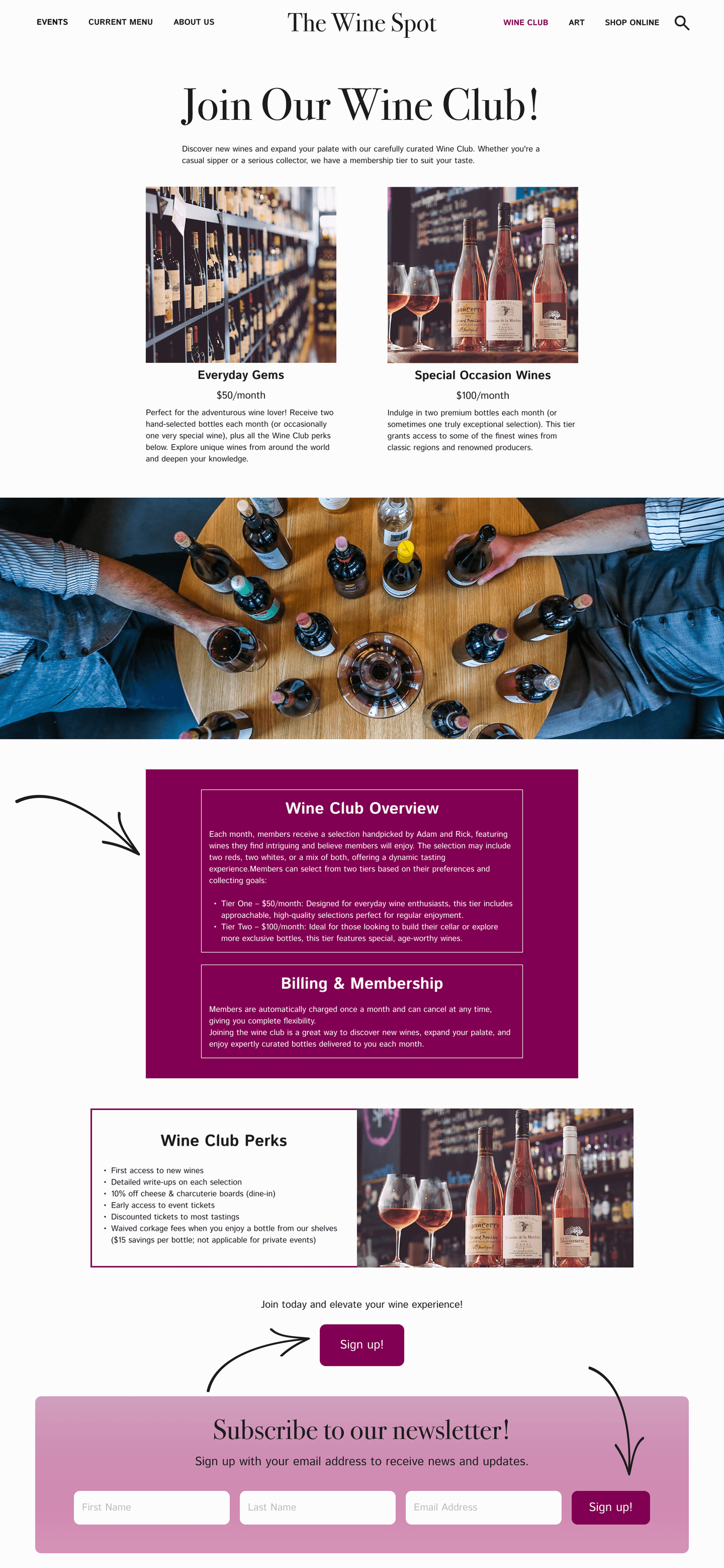
Wine Club
Reconfigured the Wine Club Overview and ‘Billing & Membership’ card into two separate sections to enhance readability
Matched the ‘Wine Club Perks’ card to match the style.
Changed the wording of the CTA to ‘Become a member’ so it didn’t conflict with the other ‘Sign up!’ button.
Before

After

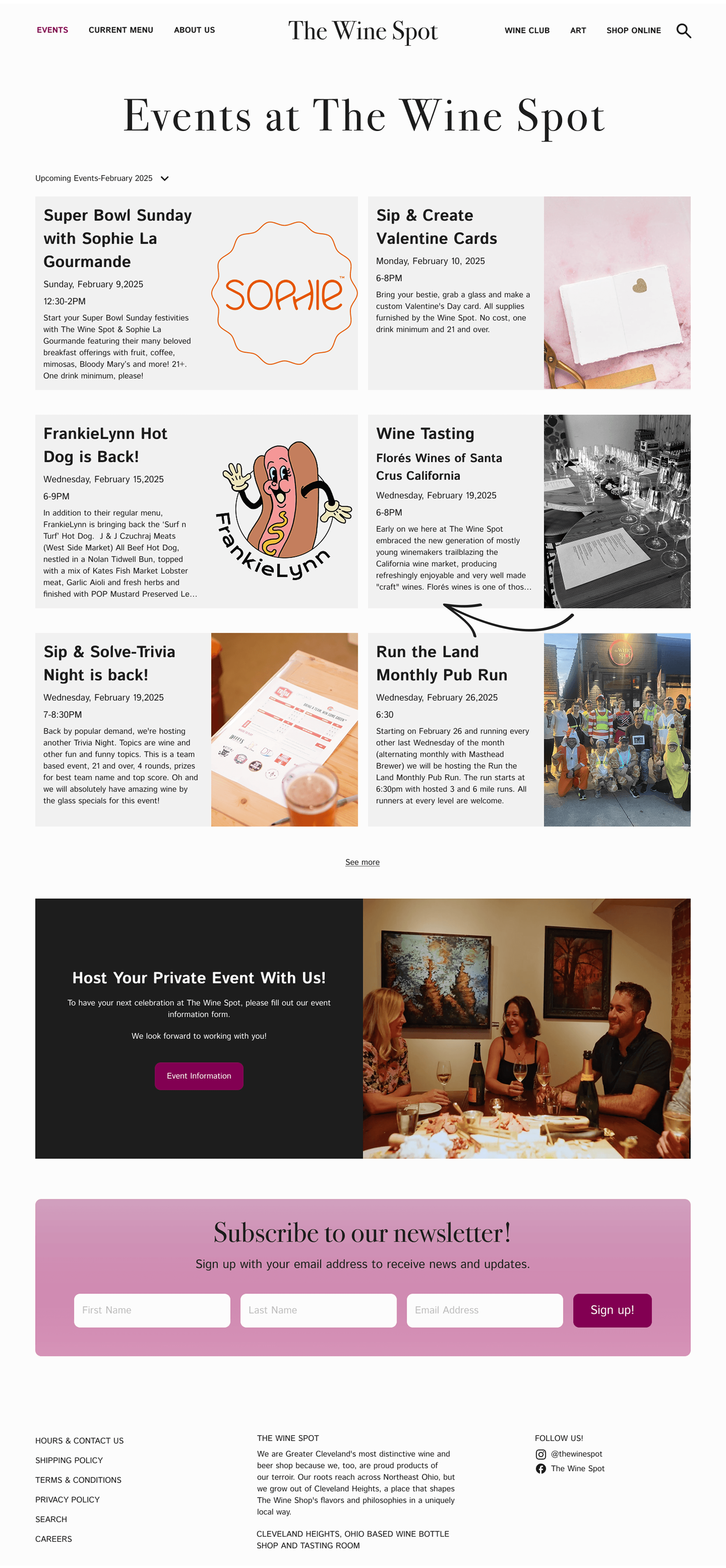
Events
Created a clearer dropdown menu for users to filter events by month.
Created an overlay for events with larger text fields and more information.
Before
After
Art at the Wine Spot
Reconfigured the artist cards so they matched in size and style. For more information, users can click on an artist and be taken to a page with their bio, more works, and be directed to their personal website.
Before

After
Reflection
Constraints
Two of The Wine Spot’s web pages are hosted by third party platforms, so I was told not to redesign either of those pages. Because there were a fair amount of user frustrations within those two pages in user interviews, I would eventually like to redesign them to offer a different perspective/layout to the stakeholders.
Main objectives
Interviews showed that users go to a restaurant or bars website to see the menu, pictures of the space and food/drink, and look for contact information and the address. By showcasing The Wine Spot’s beautiful space in the video on the homepage, adding a clear ‘Contact Us’ card and updating the photography throughout the site, users can enjoy an updated website that matches the atmosphere of the physical store.
Research insights driving design decisions
Insight: People use the website to see the space, the menu and get a sense of the atmosphere before going in person.
With the addition of the video on the homepage of the Wine Spot’s website, users get a sense of the space and the many offerings the bar provides. It clears up accessibility concerns, sheds a light on their welcoming atmosphere and showcases their exceptional service and supply.
Insight: People often go to a restaurant/bar’s social media to see their upcoming events, especially if the website seems outdated.
The Wine Spot does regularly post on Facebook and Instagram, generating a lot of content for events coming up. The difference in quality between the social media posts and their current website where they list events is substantial, which makes posting on social media really effective. With a regularly updated site, new imagery and a clearer information architecture, finding information on upcoming events will be much easier for the user.
Insight: People wanted to see regularly updated inventory on the website, especially because The Wine Spot has such an incredible variety in-store.
Because the Wine Spot hosts its inventory on a third party site, they wanted to exclude that from the website redesign. Keeping an updated inventory is a huge task for a small business with a lean team, so the owner knows that his best options are either hiring someone to take on the inventory projects full time or perhaps taking the inventory off the website completely.
Insight: Regulars want a way to stay connected without having to check the website consistently.
Making the newsletter CTA prominent on the homepage was strategic. The Wine Spot plays a big role in the neighborhood as they partner with other local businesses every week. The best way to learn about upcoming events is in their newsletter, which already has quite a large following. The prominently placed CTA will hopefully encourage even more signups and get more customers into the shop.
Next Steps
The owner of The Wine Spot was pleased with the redesign and actively wanted to get his web developer involved so they could start building the new screens. Long term, we agreed that the following ideas should be fleshed out to optimize the site further:
1
Conduct research to find the correlation between signing up for the Wine Spot’s newsletter and in-store attendance.
Does signing up for the newsletter bring in more people?
Does having the newsletter CTA button on the homepage drive sign-ups and more in-store attendance?
2
Incorporate the feedback and insights I received from user interviews across every page of The Wine Spot’s website, especially the ‘Current Menu’ and ‘Shop Online’ pages (currently hosted by third party platforms).
Users want to see a picture of the beverage/food before they order it to get a sense of what to expect. The small images on the ‘Current Menu’ are hard to see and don’t help a user make a decision.
What would be most strategic? Opting for a different design template on ‘Untapped’ (their current provider), or having a privately designed menu that is more customizable for the customer needs?
3
Since users wanted to be able to sign up for the wine club online, making sure The Wine Spot can handle monetary transactions is vital.
4
Request additional copy for Wine Club sign ups so users have enough information before they commit.
When are credit cards charged?
What is the delivery or pick up process like?
Can they request certain wines or exclude certain wines from their tier?
5
Poll current regular’s of the Wine Spot to see how much they utilize their online store to browse wine/beer inventory.